March’s college basketball finals offer a great opportunity to provide some real-world graphing experiences for our students. In this post, I share 15 graphing activities for elementary students using stats from college basketball.
Those of us who are sports fanatics, or live with a coach, know what a big deal the college basketball finals are each year!
In fact, a 2017 study revealed there are 30% more vasectomies during the first week of March’s college basketball finals than an average week during the rest of the year.* 😳
Why, you ask?
Because the multi-day recovery period means a prolonged opportunity to sit on the couch and watch TV for several days.
Talk about convenience! 😏
But, this time of year does not just give recovering patients a chance to obsess over basketball for a few days. We can get into the fun with our students too.
With all of the data generated by each game, it’s hard to ignore an authentic opportunity to bring in some real-world math.
Whether you’ve already taught your graphing and statistics curriculum standards or not, this time of year provides a unique opportunity to get students graphing using real data.
Let’s Start Graphing
With college basketball finals in mind, I’ve created some graphing activities for elementary students that combine celebrating this popular time of year with representing data using different types of graphs.
In the following sections, I share ways to collect and analyze team performance data and basketball statistics and then display the data with a variety of graphs. I also provide a detailed description of the activity guidelines and process below.
Getting Started
For this set of tasks, students will need access to college basketball statistics. The men’s statistics can be found at https://www.ncaa.com/sports/basketball-men/d1. The women’s statistics can be found on each team’s individual website.
To complete the activities, students will need to gather regular season data for specific teams, compare the regular season data of two or more teams, or use the data from a specific conference/division to complete the activities below.
All of these graphs can be assigned to students individually or in small groups. The graphs could also be done together as a class. This works especially well if you teach your graphing standards at the same time.
In terms of graph paper for a large group, I typically use one-inch graph paper on a roll because you can cut the paper to match the length of the graph you want to make.
I have also used the one-inch graph paper available on a large tear-off pad available from local office supply stores.
Teacher Tip: Regular 3″ by 3″ sticky notes work great on the one-inch grid paper because they line-up perfectly with the horizontal and vertical grid lines. If students will be graphing individually, 8.5″ x 11″ sheets of graph paper work well.
Graphing Activities for Elementary Students

A. Dot Plot
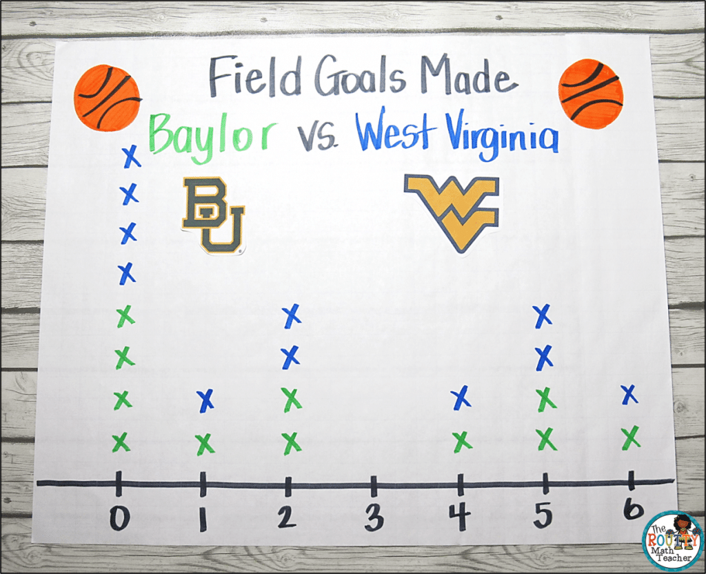
A dot plot, also known as a line plot, is used to graph numerical data along a horizontal number line. It uses Xs or dots to illustrate data.
Here are some ways to use a dot plot with basketball statistics:
- Graph the field goals made (2-point shots) during the season for the top five scoring players of several teams in the same conference. Students can use a different color for each team so they can analyze the graph later.
- Use the number of minutes each player on a team played in a final game or graph the number of games played for the regular season for each player to create a graph.
- Graph the number of wins each team in a specific conference had during the regular season.
B. Bar Graph
A bar graph is used to graph categorical data. It uses bars to illustrate data for each category.
Here are some ways to use a bar graph with basketball statistics:
- Graph the average number of points per game for each team in a conference.
- Use the number of conference wins (does not include games played outside of conference play) each team in a specific conference had during the regular season to create a graph.
- Graph the number of points scored by a specific team against five conference teams. (Because each team plays their conference teams twice, this is a double bar graph.) Students should use a key to denote game one and game two.
C. Stem-and-Leaf Plot
A stem-and-leaf plot is used to graph numerical data. It illustrates data by separating it by place value.
Here are some ways to use a stem-and-leaf plot with basketball statistics:
- Graph the number of three-point shots made for the top three three-point scorers on each team in a specific conference.
- Use the free-throw percentages for two teams during a specific regular season game to create a graph.
- Graph the number of rebounds per game for all of the teams in a specific conference.
D. Frequency Table
A frequency table is used to show categorical data. It uses tally marks to illustrate data for each category.
Here are some ways to use a frequency table with basketball statistics:
- Graph the number of conference losses (does not include games played outside of conference play) each team in a specific conference had during the regular season.
- Use the number of steals five players had during the regular season to create a graph.
- Graph the number of free throws five players made during the regular season.
E. Scatterplot
A scatterplot shows the relationship between two sets of data. Corresponding x- and y-values are recorded as ordered pairs to illustrate the data.
Here are some ways to use a scatterplot with basketball statistics:
- Graph the number of field goals (two-point shots) made versus the number of field goals attempted for the top five scoring players on a team for the regular season.
- Use the number of free throws made versus the number of free throws attempted for the top five scoring players on a team for the regular season to create a graph.
- Graph the number of three-point shots made versus the number of three-point shots attempted for the top five scoring players on a team for the regular season.
Analyzing and Displaying the Data
After students create their graphs, have students record any observations they make from the data. This can be a great springboard for a discussion about the effectiveness of individual players or teams. It may also lead to a discussion about the teams who made it to the finals and what team characteristics helped them get there.
Graphing these different aspects of basketball statistics would make a great hallway display! The data can also be used in a gallery walk where students can review the data and record their observations on sticky notes for the class to review later.
However you decide to use the data, the upcoming basketball finals make for a great opportunity to bring in some real-world graphing opportunities!
Looking for ways to integrate graphing skills all year long? Download my year-round graphing ideas using the form below.
Sound Off!
How can you use basketball statistics to create real-world graphing opportunities for your students? Respond in the comments below.
* Source: https://www.webmd.com/men/news/20180316/march-madness-a-peak-time-for-vasectomies


